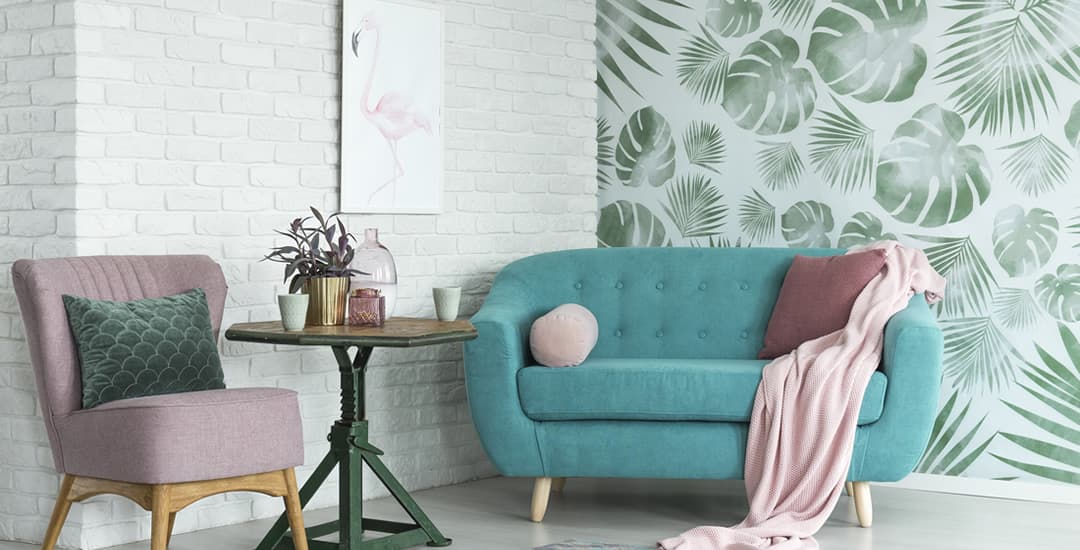
Do you remember that song that you loved so much you listened to it on repeat for weeks because it spoke to you on a spiritual level and basically became your theme tune?
You also know then how at some unspecified point in time you went from loving said tune to being unable to stand hearing it at all, and only after a couple of decades had passed were you able to hear the opening bars on the radio without switching stations.
Well, that’s what these five significantly overused design elements are to home decorating right now. They’re “Don’t Speak” circa the mid-to-late 90s, or for the slightly younger readers, Sk8er Boi circa the mid-to-late Noughties.
They’re dead, is what I’m saying, they’re just not yet in the ground.
These are the colours and elements that are still absolutely everywhere you turn and freely available to buy in the shops like they’re still a thing, except that now said shops are more or less exclusively Poundland and Wilko rather than Conran and Selfridges, possibly filtering down to the reduced section of Homesense if you like a higher class of out-of-date tat.
Anyway, with the usual caveat that talking trash for a living is how I pay the bills and that listening to my advice is likely to get you banned from TK Maxx (no really, I have a story), read on to learn the five most significantly overused design elements of 2021 that need to be stopped immediately.
Pink flamingos
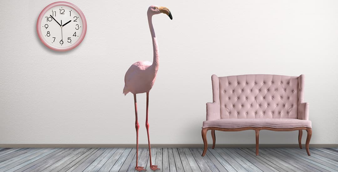
Flamingos are objectively trashy, and trashy interiors stuff is totally fine as long as the whole trashy concept is part and parcel of the point, and everyone involved is in on the joke. If it’s being used ironically, in homage to the 60s, or because it’s so trashy it’s cool, this is 100% fine.
Pink flamingos were totally on point with this, right up until around late 2019 or so.
However, they’ve come full circle now and are no longer trashy-cool, they’re just trashy-your-skirt-is-too-short. Remember kids: A flamingo is not for life, just for summer.
Rose gold
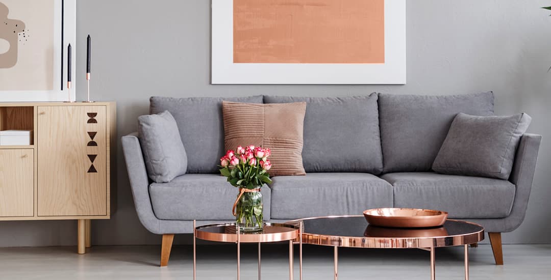
Rose gold though, honestly. I get a bee in my bonnet about this one because much as 90% of everyone who thinks they hate Turkish Delight has no idea what real Turkish Delight actually tastes like (Cadbury carries a significant weight of responsibility here and I honestly think that Turkey should sue) 90% of what is peddled as “rose gold” looks nothing like the shade of actual honest-to-God rose gold.
Even the majority of actual rose gold jewellery on sale these days is a kind of neon flamingo pink shade (segueing me neatly in from my first point there). Worse, when it comes to the rose gold shades used for mass-produced goods like trays, shelves, and as you’re no doubt aware, literally anything else, no two “rose gold” coloured things look the same.
I own an actual antique rose gold brooch that I inherited, and let me tell you, the colour of that is beautiful. Put it next to anything you could buy under the header of “rose gold” in an interiors shop today, however, and you’d probably think the colour of my brooch looked like yellow gold in comparison.
Real rose gold is not pink. Pink is pink. Stop buying “rose gold” coloured junk, you’re only encouraging them.
Duck egg
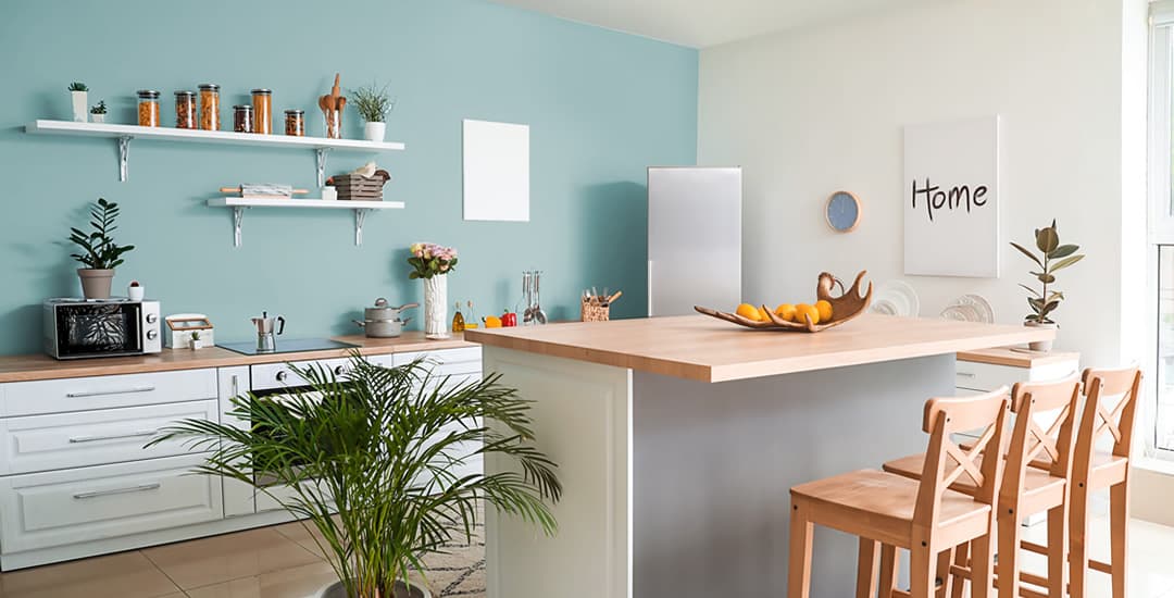
Sticking with the theme of colours, I am sure no introduction is needed for point three on my hitlist: duck egg.
I’m galled about this one because I was into duck egg before duck egg was a thing. I am also that self-important friend that only like the popular artiste’s earlier work, and who thinks that the book was vastly superior to the movie. So now that everyone else has duck-egg-everything too, well, I’m not allowed to like it anymore, am I.
Also in a similar theme to rose gold, what actually is duck egg? Ask ten people to point at “duck egg” on a colour swatch and there’s a fair to middling chance that no two of them would point at the same square.
Unlike the whole rose gold purist thing I have going on though, I’m not claiming to have any better idea about what duck egg is actually supposed to look like than the next person.
In fact, just looking up from my laptop right now I can pick out six individual items around me that were all sold to me as “duck egg,” no two of which are the same shade.
I didn’t say I was good at interiors stuff, just that I was opinionated about interiors stuff…
Palm leaves
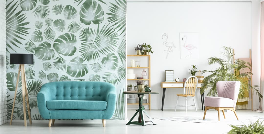
Often paired with your pink flamingo but also a popular standalone design element for everything from feature walls to mobile phone cases is palm leaves. Like said flamingos, palm designs started out with good intentions, harking back with a sense of nostalgia to those glamorous tropical air travel holidays of the 60s that few of us are both old enough and from breeding stock rich enough to have actually enjoyed at the time.
Flat-faced dogs (especially in sunglasses)
Finally, flat-faced dogs, or to give them their scientific term, brachycephalics. French bulldogs, pugs, and to a lesser extent the rather less camera-friendly English bulldog as a design element is one of my personal bugbears, and has been since when they were indeed actually new and cool.
Why? Well, right now it’s partially because French bulldogs and their other snuffling relatives as a have been done to death as a design element, but because both right now and from the absolute advent of “hey let’s put a dog that can’t breathe on a billboard to shill mugs,” the thing hasn’t sat right with me on a moral level.
French bulldogs, English bulldogs, and pugs are often bred to have such highly exaggerated facial features that they quite literally can’t breathe or do normal dog things comfortably and without risking oxygen starvation or overheating.
I get that they’re also some of the most popular breeds in the UK, loads of you own one, and I’m absolutely unleashing a world of potential pain on myself here by stating the facts, but it is what it is. The BVA has my back on this, and if you really love dogs (and especially if you own and love a flat-faced one) well, you should too.
So I clearly have a soapbox issue about dogs being deliberately bred with crippling deformities, but what’s the issue with them being plastered in character form all over prints and homewares though? Well, I’m so glad you asked. (Soapbox, I warned you!)
By using dogs like these as a design element and so increasing their public profile without simultaneously increasing awareness of the issues that often accompany flat-faced dogs and the importance of breeding and buying healthy ones, demand for such dogs increases too.
Said demand commonly comes from a market of woefully unprepared wannabe dog owners who are all ready to be parted from their money on an impulse-bought pup sold by a slick-talking breeder, despite the fact that said pup might come accompanied by a lifetime of debilitating and costly health issues that the buyer in question has no clue are even a thing.
TL;DR/ “hey I thought this post was going to be funny, I call fake news;” flat-faced dogs (especially French bulldogs) are by far the most overdone design element of all, with bonus demerit points awarded for prints of flat-faced dogs wearing sunglasses.

